Flow Task

Transforming FlowTask’s Website for a 35% Boost in Conversions

Challenge

FlowTask struggled with low conversions from free trials to paid plans. The original website lacked a clear message, the hero section was cluttered, and the CTA was buried under excess content. Users couldn’t quickly grasp the product’s value, leading to high bounce rates and missed opportunities.

Our Approach

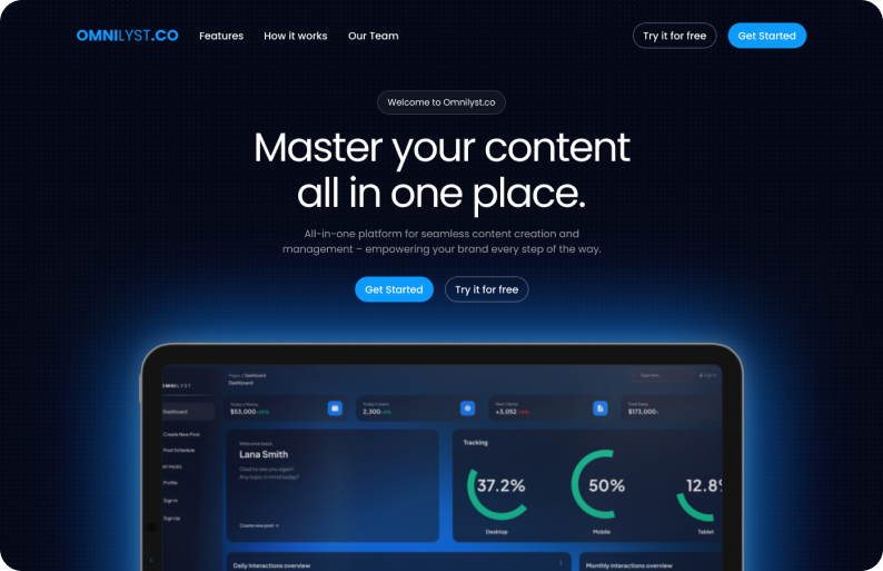
Our goal was to create a focused, conversion-oriented website that communicates FlowTask’s value in seconds. We tackled the redesign with three core principles:

  1. Clear Value Proposition:
Replaced vague messaging with a headline that speaks directly to the user's pain point and solution:
"Stay on top of tasks effortlessly – Manage projects, not chaos."
  2. High-Impact CTA:
Added a prominent gradient CTA button (“Start Your Free Trial”) in the hero section with a clear visual hierarchy. The button is now impossible to miss, encouraging users to act immediately.
  3. Simplified Layout and Visuals:
Instead of lengthy paragraphs, we showcased key product benefits using three simple icons and short captions, ensuring users could scan the content quickly.

Results

The redesign had a significant impact within the first 30 days:

  • 35% increase in free trial to paid plan conversions.
  • 12% growth in total sign-ups.
  • Users spent more time on the site, with the bounce rate dropping by 18%.

Client Feedback

"We had no idea how much our website was holding us back until we saw the redesign. The new version feels modern, professional, and user-friendly. Milos’ work gave our brand the polish it needed, and we saw results almost immediately." — CEO, FlowTask

Interested in working with us?

Contact Us