Oxygen needed a brand identity that would communicate calmness, trust, and empowerment.
Challenge
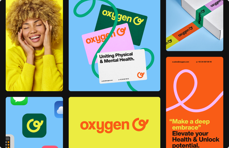
Oxygen needed a brand identity that would communicate calmness, trust, and empowerment. Their original branding was inconsistent, and users found it hard to connect emotionally with the product. The challenge was to create a visual identity that made mental health support feel accessible and stigma-free.
Our Approach
We developed a soft, approachable brand identity aligned with Oxygen’s mission:
Color Palette: Used soothing blues and light greens to evoke calm and safety, with splashes of pastel orange to symbolize hope and growth.
Typography: Selected a rounded sans-serif font to create a friendly, non-intimidating feel.
Logo Concept: Designed a simple circular logo to reflect balance and continuity, incorporating a subtle oxygen bubble motif.
Brand Voice: Crafted a tone that was empathetic and uplifting, with taglines like: “Breathe Easy. Find Your Calm.”
Results
25% increase in app downloads within three months of the rebrand.
Lower churn rate, with users reporting a stronger emotional connection to the product.
Positive feedback from mental health professionals on the approachability of the branding.
Client Feedback
"The new branding for Oxygen perfectly represents who we are. It feels like an invitation to wellness – exactly what we wanted." — Founder, Oxygen